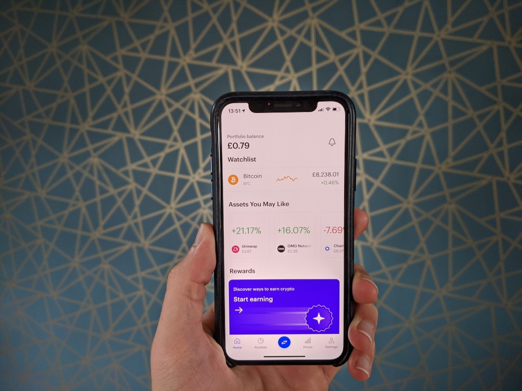
Digital currency exchange Coinbase has probably done more than most to push cryptocurrencies closer to the mainstream, earning an $8 billion valuation by private investors along the way. The company is reportedly eyeing a public listing next year, and is inarguably doing a lot of things right. However, that doesn’t mean its product experience is perfect. In fact, far from it.
In our latest UX teardown, with the help of Built for Mars founder and UX expert Peter Ramsey, we highlight some of Coinbase’s biggest user experience failings and offer ways to fix them. Many of these lessons can be applied to other existing digital products or ones you are currently building, including the need to avoid the “Get Started” trap, the importance of providing feedback, why familiarity often wins and other principles.
The ‘Get Started’ trap
Only use CTAs like “get started” or “learn more” if you’re actually teaching users something.
The fail: Coinbase doesn’t actually have any onboarding — but it looks like it does. It has a very prominent “get started” CTA, which actually just puts bitcoins in your basket. This isn’t helping you get started, it’s nothing more than an onboarding Trojan horse.
The fix: It’s simple: Don’t lie in your CTAs. You wouldn’t have “Email Support” as a CTA, and then just show the user a bunch of FAQs.
Steve O’Hear: This feels like another classic “bait and switch” and reeks of dark pattern design. However, what if it actually works to get users over the line and purchase their first bitcoin? Growth hackers, rejoice, no?
Peter Ramsey: You’re absolutely right, this may convert better. From a business point of view, this could be a brilliant little growth hack. However, something converting well doesn’t mean it was a good experience for the user. Look at clickbait-y journalism — it gets more eyeballs, but people aren’t generally happy with what they read.
I’m convinced that in the long term having a great product will perform better than frustrating short-term growth hacks.
Feedback architecture
As a general rule of thumb, all “states” — e.g., success/failure of an action — need to provide feedback to the user.
The fail: After adding a card, you click “Add Card,” and … it takes you back to the homepage. There’s no notice if it was successful or not. The user has no awareness if the action they were trying to do failed and they need to do it again. This is a real problem with digital products: All feedback needs to be thought of and built.
The fix: During the design phase, consider statuses and what the user will want feedback on. For example, if they’ve just added an item to their “wishlist,” how will you show them that the action was successful?
Not providing user feedback seems like such a rookie mistake. Yet when I look around the physical world, most products have well-established feedback systems, either tactile, such as the physical click of a button, or visual, like a light coming on to indicate an “on” state. Sometimes, in the physical world, feedback is even more subtle or subconscious, akin to reading body language. Perhaps this is why digital feedback is sometimes taken for granted when in reality it is something digital products should double down on?
Yep, exactly that. We totally take for granted the feedback available in the physical world, there’s just so much of it. An extreme example of this would be VR. To make a world in VR feel “real” is incredibly difficult. If you’re walking through a field of grass how would you replicate the smell, the wind, the random stones that crumble under your feet, the heat of the sun.
Now, with software we rarely do anything as complicated as a VR world, but still, you need to replicate a sense of feedback. Clicking X changed Y and Z. And in that, you may have variations of what can go wrong — all of which need to be built.
Familiarity often wins, especially for startups
There are some parts of web/app design that are so ingrained now, that building something that counters this tradition will actually make your product more difficult to use. Often, originality is punishing.
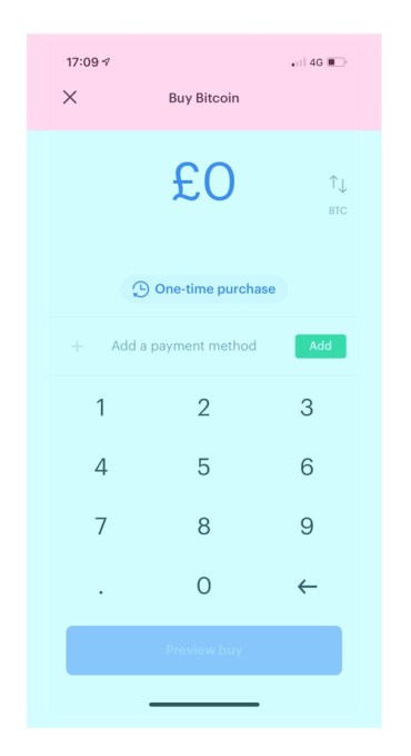
The fail: The only way you’d know that you were buying bitcoin on this page, is if you read the page title — which is in the header. The natural first viewing of this screen is messy, because people try to work out what they’re doing from the body of the content, and eventually work their way up.
The fix: I’m not suggesting that you can’t put things in the header — not at all — rather, that the main body of the page should also make it clear what you’re doing. If you have unique content in the header, it’ll likely be missed.
The late Jef Raskin, who actually started the Macintosh project at Apple, once told me what he called a “Sesame Street lesson:” If you want to design something significantly better, then it has to be significantly different to what has previously existed.
However, what you appear to be saying is, if you are going to strive for originality, make sure it really is better, because there is always an unfamiliarity cost?
So I think Jef’s point was much bigger than what I’m suggesting. If you wanted to make something better than a Sony Walkman, it needed to be much better than a Sony Walkman. It needed to be the iPod — which was different in almost every way.
However, if you’re trying to make a better bank, you don’t need to reinvent how people make a payment. In fact, my point is that if I signed up to a bank whose app was wildly different from other banking apps, I’d probably find it alien and confusing. There are no points for originality, unless your new way of doing things is worth the effort of learning how to use it.
The inherent risk of using third-party data
Often you’ll want to show information supplied by third-party companies. However, it is paramount that you make sure this data is accurate and displays correctly, and not assume that you are purchasing “clean data.” As you’ll see, when it’s wrong, it’s your fault.
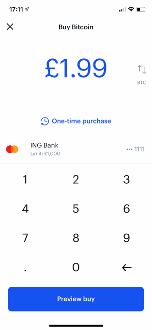
The fail: When using my Starling bank account, it appears as “ING Bank.” The user will attribute this obvious error to Coinbase, not to the third party that facilitates this data.
The fix: Yeah, it sounds boring and time consuming, but you need to check all your data. How does it all display? Does it use a friendly name, or an arbitrary legal name. e.g., “Finance Accounting Limited” rather than “EasyFinance.”
There’s no substitute for hard work, right? However, I’m wondering where checking third-party data integrity and how it displays should be placed in the design or QA process? Especially as being third party it is something that needs to be continually monitored.
So I’ve had to deal with this exact problem myself for a business, and we literally solved it by checking each one, then hardcoding the response. It’s not ideal, and is time consuming, but the problem is that often you get third parties, who pull in data from other third parties, who scrape some register online once a month, and it trickles through systems until it hits your dashboard. Then, you get a bad reputation from your users.
Never give unspecific values
If you’ve got tiers of any kind, or restrictions, you need to give specific values. Otherwise, users can’t accurately determine which is the best option for them.
The fail: Coinbase offers different methods of paying for cryptocurrency. One of these is “Credit/Debit card,” which clearly Coinbase has to pay a fee on, which is why they say it’s limited to “Invest small amounts.” But how much is a small amount? Where is the limit? Is £100 small? £10,000?
The fix: If you have tiers, or limits, make sure you point out where these are. For example, imagine if Netflix had two tiers:
- Unlimited streaming.
- Limited streaming (you can watch only a few movies a month).
Is “a few” two? Five? 10? It’d be impossible to accurately decide which package was right for you. You need to be specific.
This is just sloppy and for the life of me I can’t see how not providing specific values benefits either party. Is this an honest mistake or do you think other design goals took priority, such as maintaining a certain tone of voice or brevity within the copy?
Yeah, I’ve been wondering this too. My opinion is that the actual limit for debit cards is higher than they’d like you to send. For example, it might be £10,000 per transaction, but they’d rather you use another method at £2,500.
It’s totally bad practice and something they should change, but I imagine they’re experimenting with ways to reduce the number of people who pay by card.


Comment