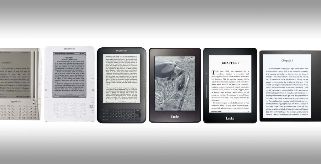
The Kindle has become one of the most ubiquitous pieces of specialty electronics in the world since it launched 10 years ago today, but the device has changed so much since its debut that one can hardly believe the oldest and newest models are meant to do the same thing.
Amazon’s Chris Green, VP of Design at its Lab126 hardware arm, talked with me for a retrospective of the design choices that have defined and redefined the device, and the reasoning behind them. Green has been at Lab126 for a long time, but not quite for the entire Kindle project, as he explained to me.
We can never be better than paper, but we can be as compelling.
For the next decade he’d work on getting the Kindle closer to what he called the “gold standard”: paper.
“We can never be better than paper, but we can be as compelling,” he said. “We really didn’t want any bezel or bling or even page-turn buttons — everything we’ve done over 15 generations has been to reduce it to basically a piece of paper.” (With the new Oasis there have actually been a total of 16 “generations” or models.)
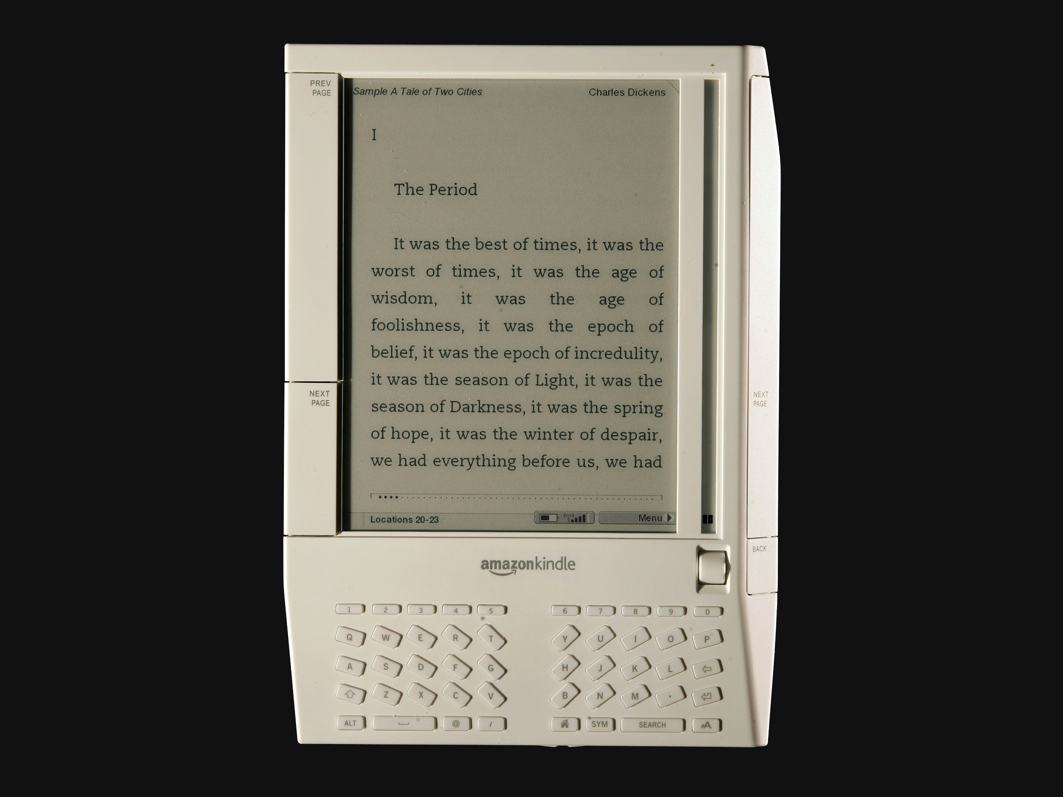 That may come as a surprise to those who remember the first Kindle, which with its chunky angles, slab-like buttons and aggressively ergonomic keyboard, seems almost brutalist. I’ve always thought it would look at home on the set of Alien.
Although he didn’t help create the first generation, Green is plenty familiar with its design language. Turns out there’s a very simple reason behind the angles.
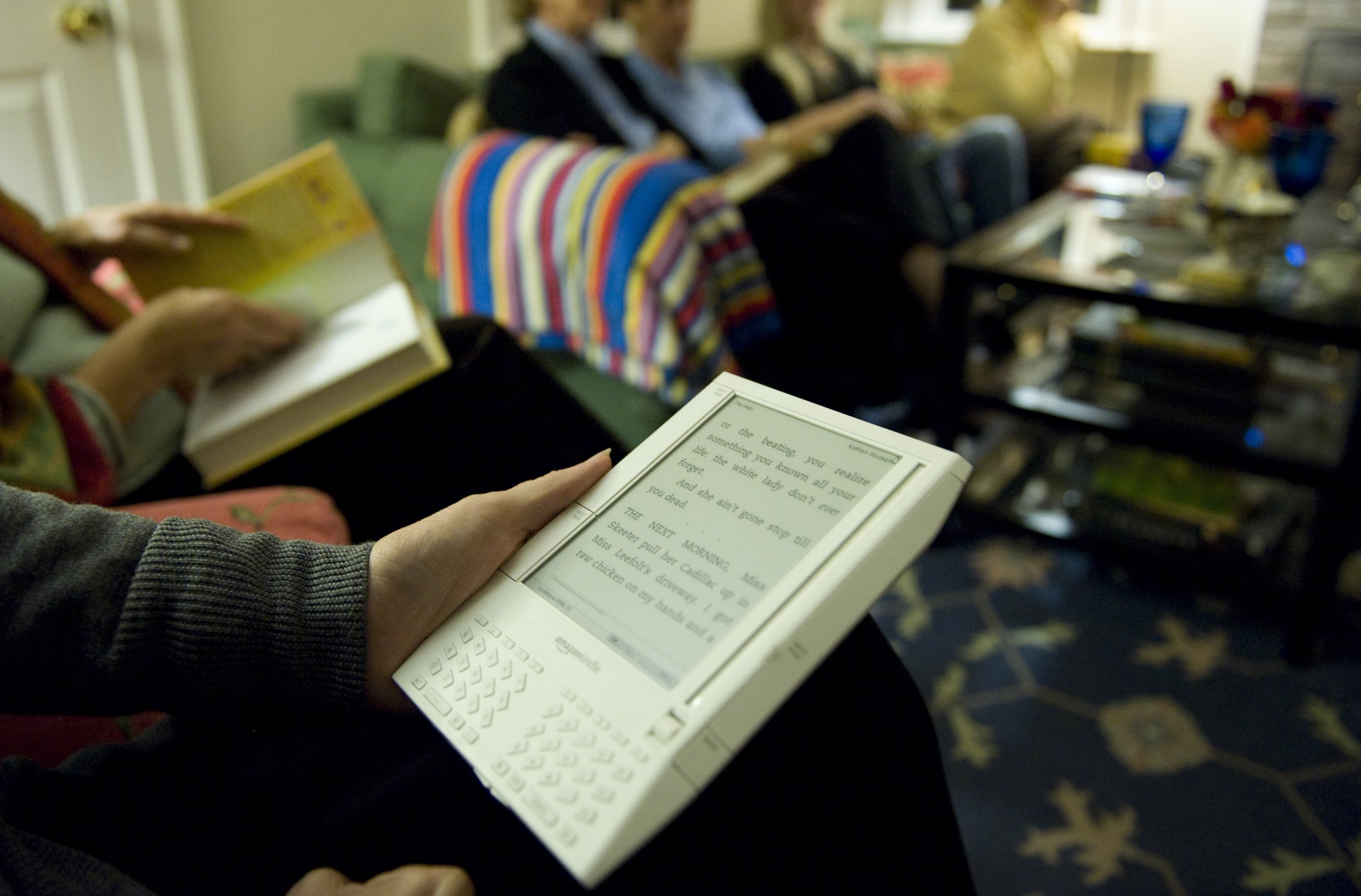 “If you have one of those around, you’ll notice that the cross section is actually that of a paperback book — the pages go at that angle,” Green said. “The dimensions are even a standard paperback’s. They were trying their hardest even at that early stage to represent a paperback book.”
That consideration more or less went out the window with the second-generation Kindle, which did away with the sloping pages visual metaphor and walked back many of the other bold but unusual choices.
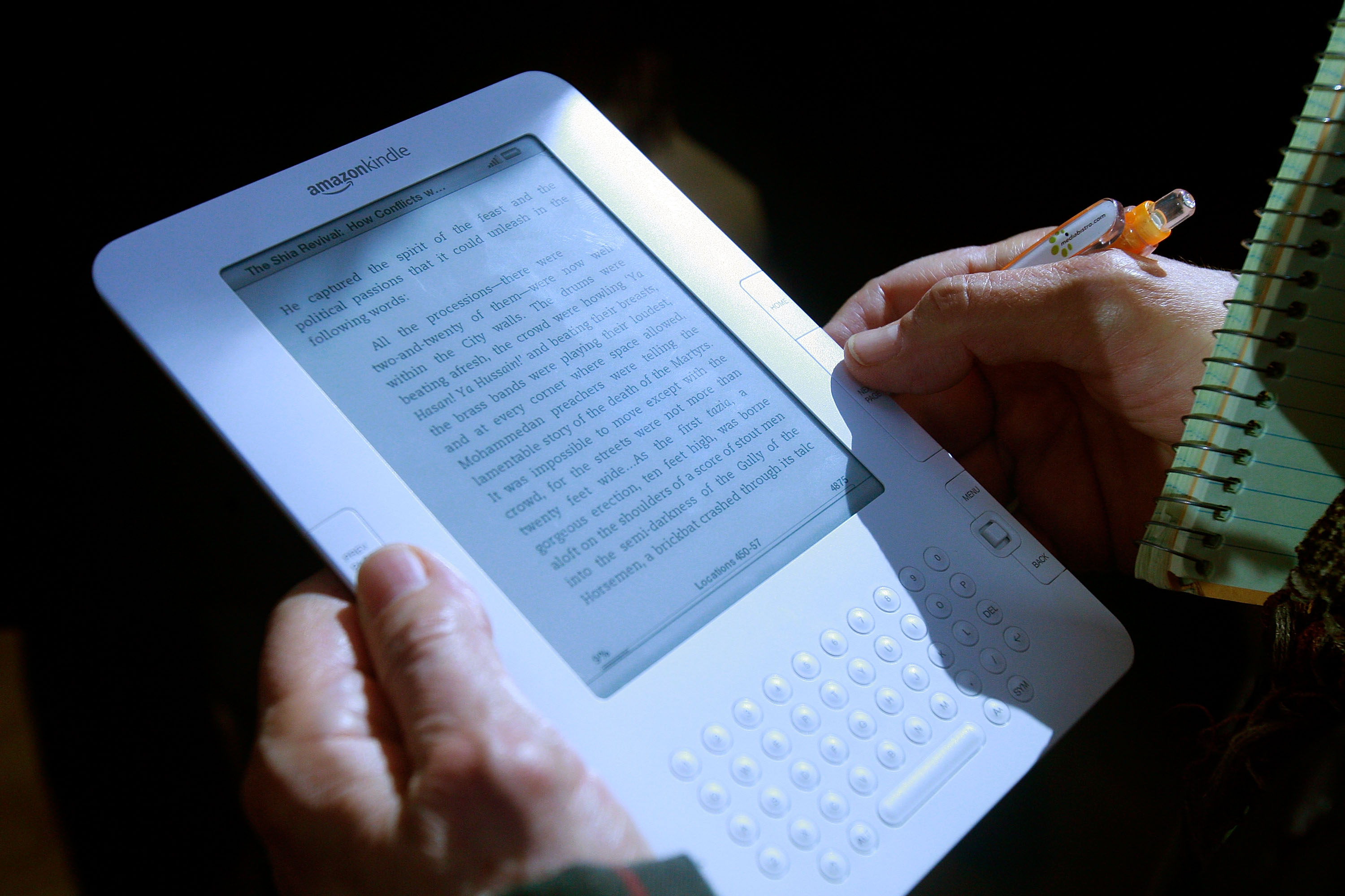 “All the pitch points of the original Kindle — the little Chiclets, and the fact that the keyboard was split — those were very logical. It’s very ergonomic,” said Green. “So everything is very logical — but when you take a deep breath, and take your head out of the bucket, you’re like, wait, there’s an easier way to do this. There’s no reason for those keys to actually be shaped like that.”
The redesign was aimed at making it approachable and attractive to a wider demographic — one that might not appreciate the severity of the original. In my opinion, it worked: the clean lines and carefully designed proportions made the Kindle 2 a real looker, and years later it still holds its own.
After this, Amazon introduced the short-lived Kindle DX, a large-format e-reader that didn’t catch on, partly because the market for larger-format reading (articles, journals) wasn’t as large or ready to spend money than the paperback-buying contingent.
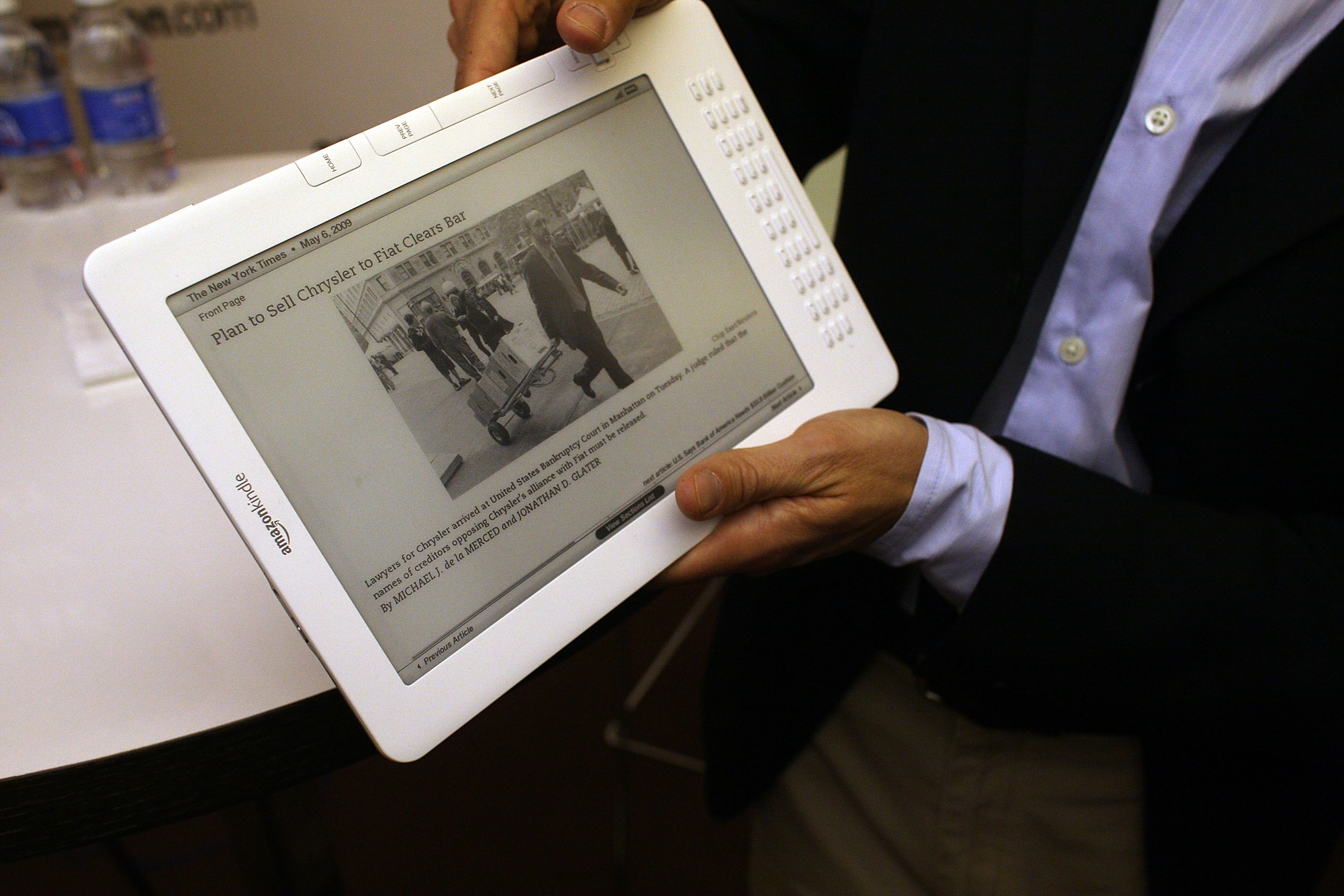 One particularly high-end feature got nixed before the DX even hit the market:
“In the first version of the Kindle DX, the back had a fully quilted surface — originally it was actually fabric, but that was too expensive,” Green said. But more importantly, he said, “the highs and lows get wear and tear. We don’t want people to be on the treadmill of upgrading, so we put a lot of effort into durability.”
Green also mentioned the attention paid to features that are less easy to define — basically, all the tiny things that make a device better or worse to read on.
“Over the first few generations we spent a lot of time with customers — we went everywhere with them,” he said. “We had a really cool reading lab in our building where we would watch people read and see how quickly people’s eyes got bored as they scan a line of text.” (“When people read,” he added, “they fidget like crazy. It’s uncomfortable to watch.”
They determined the best spacing, kerning, line length and so on, making sure that the device improved in readability even as they changed other aspects of it.
Going dark
The third generation made a few small changes and one big one. The physical interface continued to shrink relative to the screen, moving slowly toward that gold standard. But more importantly, the device’s main color went from off-white to off-black (“graphite”).
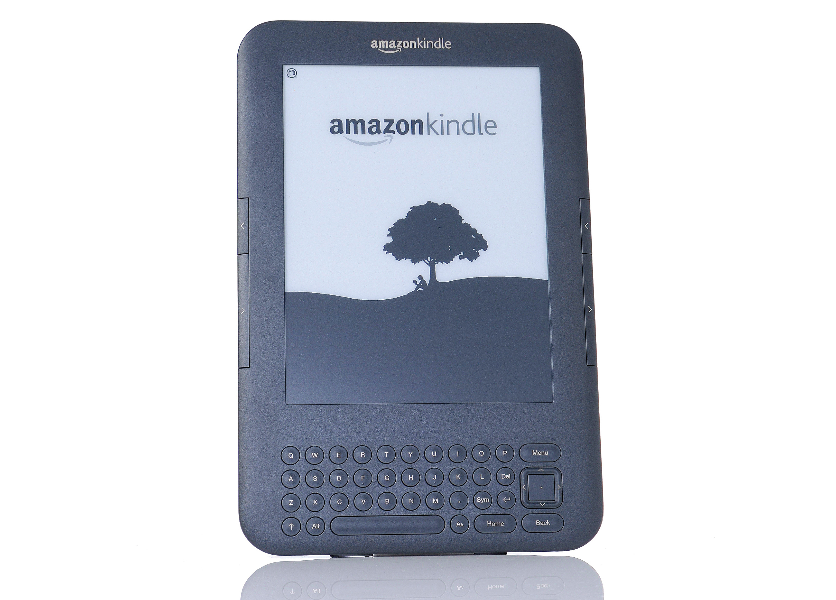 Was this a response to black smartphones? Fingerprint complains? Material shortages? Nope: as some have suggested, it’s meant to trick the eye.
See, e-paper isn’t really white, it’s really a shade of grey, and not even a particularly light one. So when you give it a white bezel, the white plastic shows it up and makes it look even more grey. But with a black bezel, it works in the opposite direction: it makes the grey look lighter, and as a consequence, the “black” letters, actually just a darker grey, look even darker.
“That’s exactly the reason,” Green said. “We moved over the graphite to help with the contrast ratio. We wanted the black text to pop more on the display.”
Combined with a new Pearl display from E Ink, it made for a major jump in contrast. And they’d need that before moving on to the next generation.
The fourth-generation Kindle was the first to do away with the keyboard, producing a notably smaller device. It seems to me to have lost something of its soul with this change, though; the Kindle 4 and its successors reminded me more of budget tablets of years past rather than a brand new device.
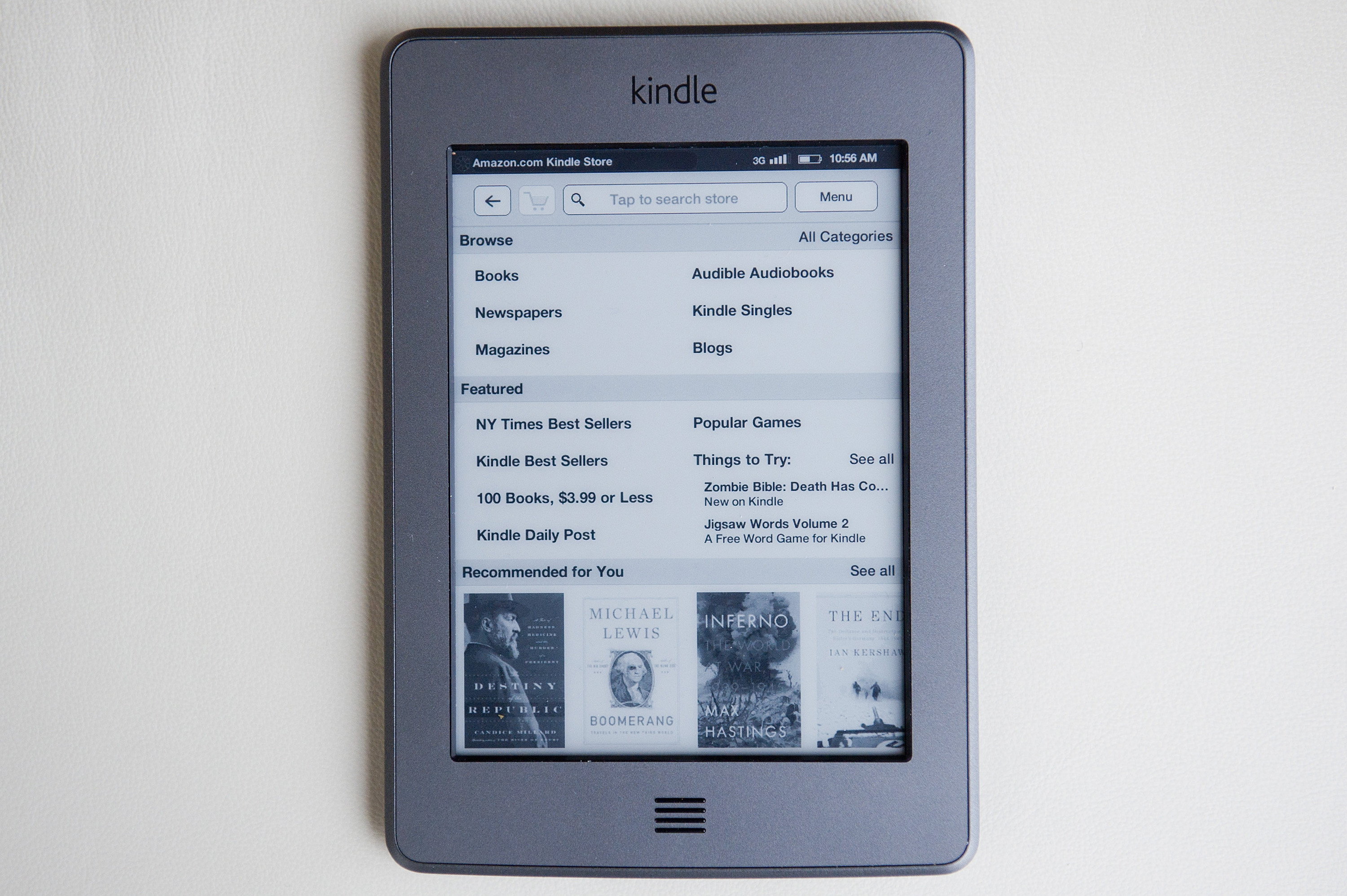 It was the Kindle Touch, however, that signaled the future of the device — although at the time, I wasn’t very impressed with it or its competitors.
“We always wanted touch,” explained Green; the keyboard and other buttons on early models were largely necessitated by the low refresh rate of e-paper displays. “The thing is, those touch displays aren’t optically clear. When there wasn’t a frontlight, and you put this yellowing, sepia layer on it, it really made the contrast ratio worse.”
The solution, a network of infrared blasters and sensors that could only tell roughly where you put your finger, was a stopgap measure.
“If you have to take your thumb off the bezel, and put it over the display and put it down, that’s cognitive load right there,” Green said. We used that IR window until we got the frontlight working, because that would burn away that sepia layer.”
Let there be frontlight
The frontlight was already well under way, and would be announced in the form of the Kindle Paperwhite. I saw a prototype several months before that, and it turns out Amazon had quietly acquired a company in 2010 called Oy Modilis that specialized in light-guiding films like those used in the Paperwhite.
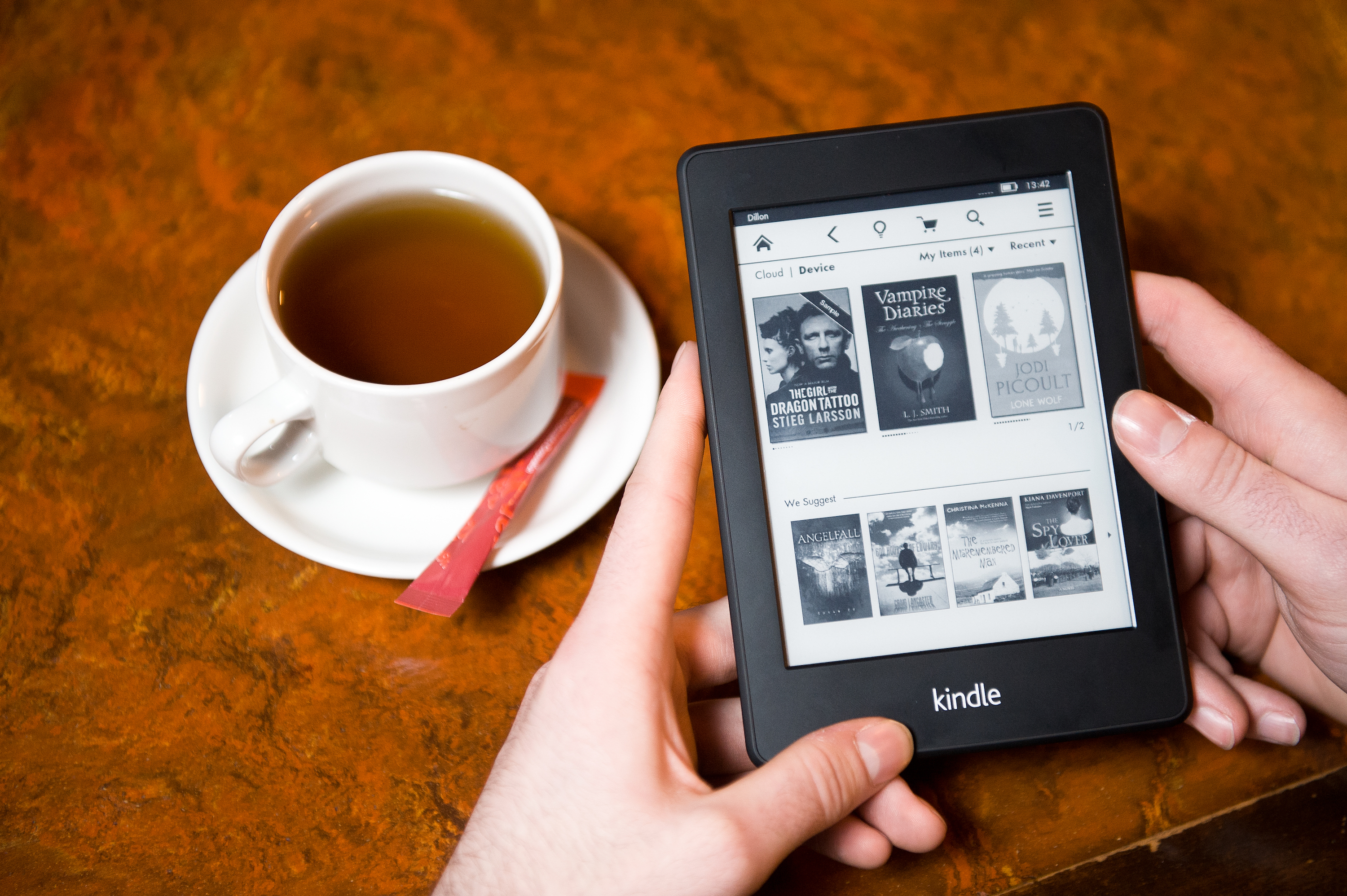 At the time, having taken care of even lighting, the designers were mostly worried about color temperature. The warmth of a tungsten bulb or flame illuminating a creamy page and ink-black (naturally) text is very difficult to replicate, and at the time they had to settle for something quite a bit colder, color-wise.
“White LEDs are binned into 3 different temperatures: warm, blue, and neutral,” Green explained. “And by mixing those bins you can get a nice blend. So we’ve played with those blends to get where we are now — but there’s always room for improvement.”
Although a frontlight makes for a vastly more convenient reading device, the color cast isn’t for everyone. But Kindle has never gone the way Kobo did, adding a user-selectable color temperature setting. The team opted to keep things simple, Green said.
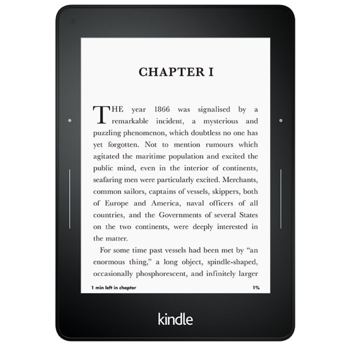 In 2014 the Kindle line split again, adding the Voyage to the mix. In service of streamlining the device further it was decided to add an invisible alternative to tapping the screen to advance the page. PagePress used sensors inside the body of the device to tell when a user gave the edge a little squeeze, allowing them to advance the page even more intuitively. To Green’s surprise, the feature wasn’t particularly popular.
“The page-turn buttons on the Voyage were expensive and very cool, but there’s something about the button snap that’s very satisfying,” he said. “I was so surprised that people didn’t like the PagePress tech, because it was silent, and a dome switch is noisy. People complained that the noise kept people up.” A lot of research had gone into it, but ultimately PagePress didn’t become a staple of Kindle design.
Some six months later, the third-generation Paperwhite appeared; its chief improvement was a new high-resolution display, but what can’t be ignored is what that improvement allowed typographically. Amazon commissioned a completely new font built from the ground up for the Kindle’s display and type engine: Bookerly.
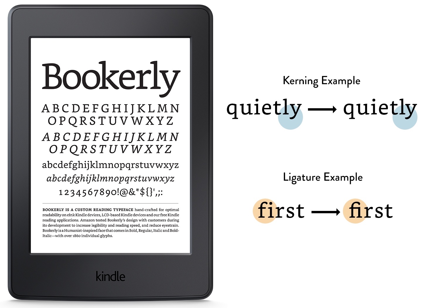 Bookerly wasn’t a huge advance in typography or anything, but it’s an important philosophical shift — acknowledging the strengths and limitations of the type environment and designing for them, rather than attempting to ape paper. An e-paper display needs its own font and styling just as a newspaper does, or a textbook, or a logotype. Custom e-reader fonts had appeared elsewhere, so it was well past time Amazon did its own or risk looking lax in its dedication to the platform.
Farewell to symmetry
The Oasis represented the largest change to the design of the Kindle perhaps since the loss of the keyboard. It also signaled further commitment to the e-reader as its own entity that only needs to replicate the printed page in some ways. Green said that the departure from the old style was a refreshing one for him.
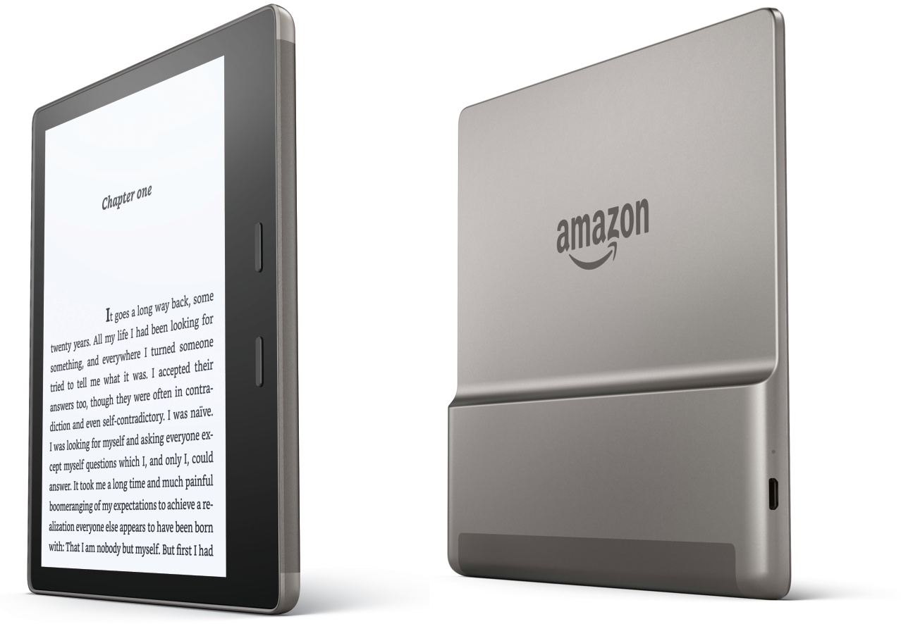 “There are certain things in the world that humans consider beautiful: the Golden Ratio, Fibonacci sequences, and of course symmetry,” he said. “We got in a tight spot with the symmetrical design in that we couldn’t take it any further — so we took a bold shot with the Oasis.”
“When you see people using these devices,” he explained, “it becomes very clear that they want the center of gravity in their hand and the button under their thumb. But having physical buttons on both sides would be prohibitive [in terms of space]. An e-ink device today is basically a stack of display components and a stack of battery components, and those technologies are progressing at very different rates.”
So they isolated the battery on one side, making it asymmetric (at least, in its normal orientation) but also solving the center of gravity, handedness and page-turn problems.
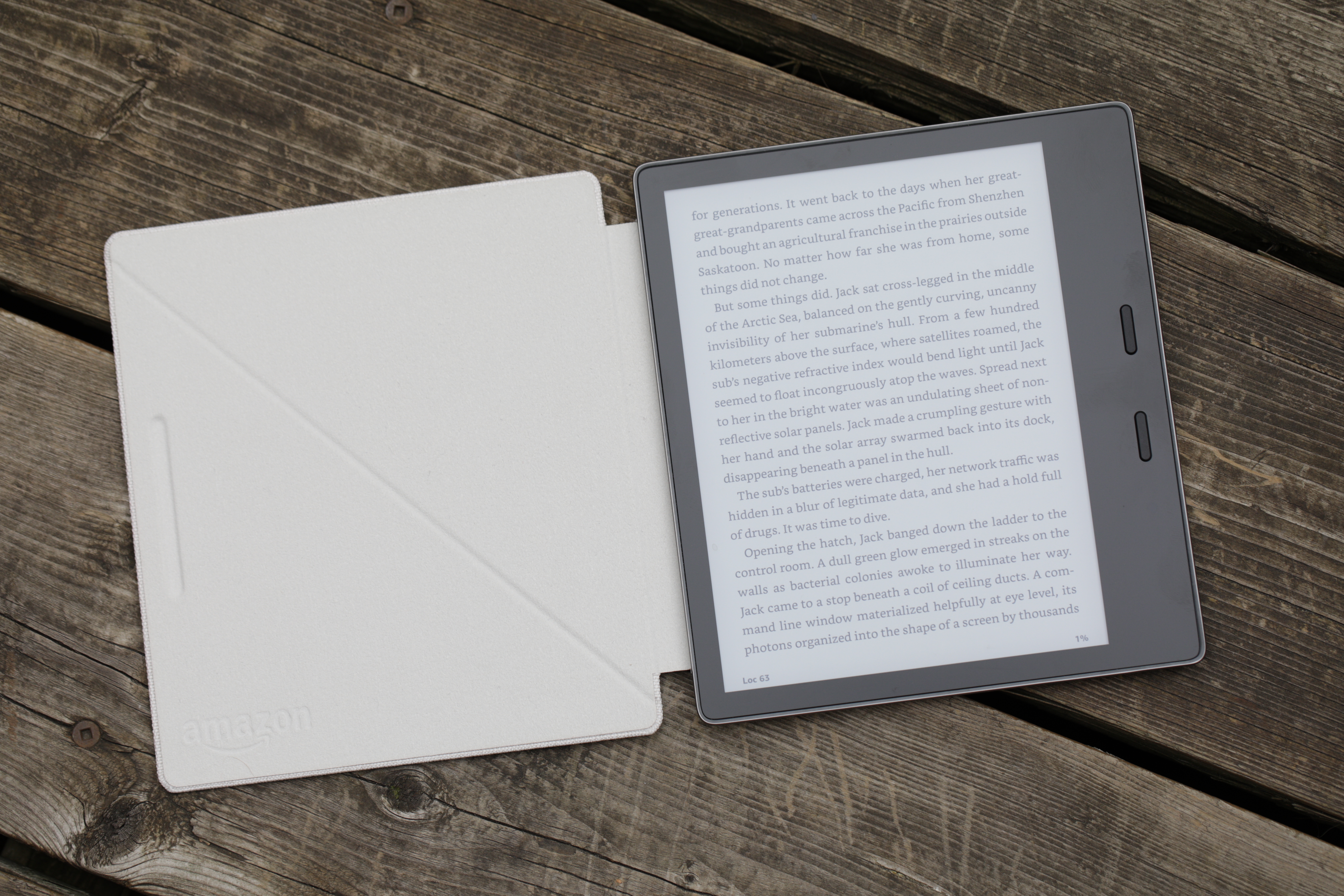 The new Oasis is actually a major departure from its predecessor in that its screen has expanded to fill more of the device: it’s the first Kindle with a 7-inch display, yet it’s no larger than before. That takes us closer to the “gold standard.”
It also brings us up to the present, though the design is sure to evolve in the future.
The one you’ve not seen
I asked Green if among the many, many Kindles there was one he’d call his baby, a sentimental favorite.
“My answer’s a cop-out,” he said, truthfully, “but it’s the one you’ve not seen yet.”
The difference between a hammer and a Swiss Army Knife.
He was extremely optimistic as to the future of e-readers in general. It’s a great example of how a device with a single purpose is often the right tool for the job.
“It’s the difference between a hammer and a Swiss Army Knife, isn’t it? If you want to go on a vacation or commute, you want a hammer — you want a real e-reader, so you don’t fall down a rabbit hole of your phone.”
And the Kindle business, he pointed out, is booming: “The last Prime Day was the best sales day ever in the U.S. — and the market is just growing. It’s taking off,” he said.
“We’re going to be here for a long time.”









Comment